0.6 Update - Small fixes
Minimal Dark HD Aseprite Theme » Devlog
After using the theme for a few weeks, I've made bunch of small fixes and updates on certain elements that were bothering me:
 Added some tags that were missing, now we have button backgrounds on the top bar.
 - Resized the radial buttons to fit better.
 - Added a background to the text links.
 - Recent files now is more readable and aligned to the left.
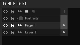
  Darkened layer/timeline window surroundings.
 - All scrollbars are minimal now and are all the same size/colors.
 - Button Selected is now an outline instead of a solid color.
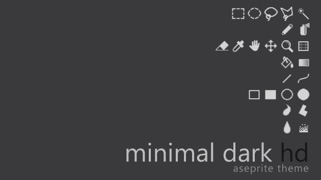
 - New cross-hair icon.
 - Rounded corners for tabs, new background color for the close button.
The latest Aseprite beta 1.2.10beta3 has added the .aseprite-extension format, so you just need to double click the file to install it this time. If you're still using 1.2.9 stable, just install the extension via the Preferences menu as usual.
Once again, thanks to everyone that is using the theme, provided feedback or donated, it's much appreciated.
If you have any bugs or suggestions, contact me on twitter or my email.
Files
Minimal_Dark_HD_0.6.aseprite-extension 42 kB
Dec 09, 2018
Get Minimal Dark HD Aseprite Theme
Download NowName your own price
Minimal Dark HD Aseprite Theme
A clean non-pixelated theme for Aseprite
More posts
- 1.0 Update - Text Tool + Other small things31 days ago
- 0.9 Update - Tilemap Icons for 1.3 betaMay 30, 2021
- 0.8 Update - Dynamics icon and slidersApr 27, 2020
- 0.7 Update - Aseprite v1.2.11 compatibilityMay 14, 2019
- 0.61a Update - Small fix for OSXMar 20, 2019
- Minimal Dark HD 0.5 - High Resolution Icons and Pointers for Aseprite!Nov 05, 2018
- Minimal Dark: 0.4Mar 07, 2018
- Small update to row/columns sizeSep 27, 2017
- Updated Minimal Dark to 0.2Sep 25, 2017

Leave a comment
Log in with itch.io to leave a comment.